Informing without overwhelming, the secret to designing great in-car user experiences
&w=256&q=90)
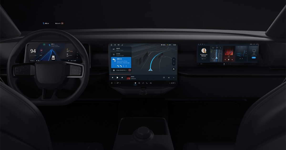
Alongside drivetrain electrification there’s another trend growing in the car world: screens. In cars of the future, there will be more display real-estate on the dashboard than ever before. But what are we supposed to do with all that display space? More importantly, how do we use these screens to improve how we inform the driver, without overwhelming them to the point of distraction?
For automotive UX designers, it’s easy to be swept away with the excitement of having so much digital space to play with. Indeed, having screens in the form of a head-up display, the instrument cluster, the center stack and even on the passenger dashboard, presents immense opportunity to display content and vehicle information.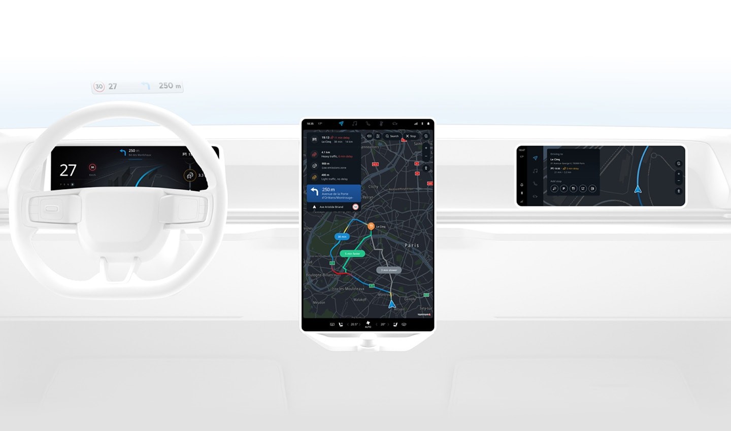
New cars are coming with more screen real estate than ever before. Alongside head-up and cluster displays, large central and passenger displays are trending.
Designing effective in-car user interfaces isn’t simply a case of displaying as much information as possible and making it look as attractive as possible. Drivers want detailed information about their journey and vehicle. However, providing them with too much information will result in cognitive overload. In the worst case, they will become distracted from the road.
According to Drew Meehan, TomTom Principal UX Interaction Designer, it’s all about balance — less can quite often be more.
Finding balance in information overload
The key is to achieve an informational balance so that cognitive overload is allayed by providing drivers with an interface built around “action plus overview”. When this is achieved, information displayed on each screen should complement the next and cascade naturally. This provides drivers with enough information in the cluster to inform action, but also displays a broader overview of the journey in the central display to reassure the driver, Meehan says.
Compare the differences: The top image shows only the essential information, the lower image overloads the driver with detail. In these cases, it's about finding balance between cognitive overload and insights that support action.
Suppose you’re driving an electric car with three “screens”, a Head-up Display (HUD), a cluster and a center stack. The HUD, projected onto the real world, should only display information about the here and now. The cluster should show details about the next action the driver needs to take. The center stack should display a longer-term overview of the journey ahead, including the route, traffic and how far away charging points are for example.
Structuring the screens in this way creates a natural flow for the driver’s eye from the present moment to the future. As their eye transitions from the road, to HUD, to cluster, to center display, the information shown changes to support their needs and expectations. Everything has a place, and everything is in its place.
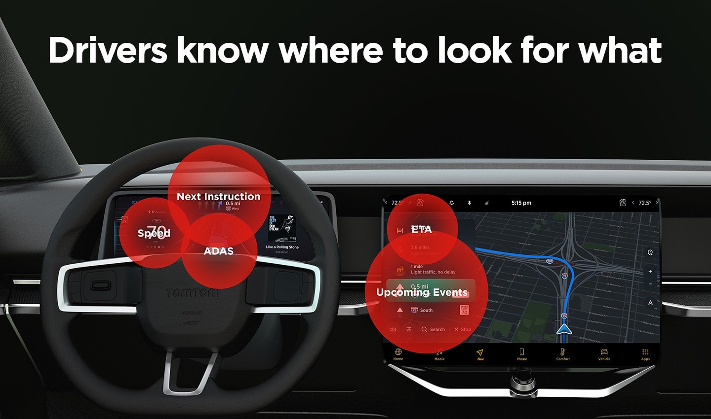
When display interfaces are designed as an entire ecosystem, drivers know where to look for information.
The next challenge
This is simple in principle, but not all cars are created equal. One carmaker may produce a range of vehicles that each use different screen sizes, options and configurations across its lineup.
For user interface experiences to scale across a range of vehicles, there are a few design strategies that should be followed.
Firstly, what’s displayed should respond and scale to the size of the panel. This means that entire car ranges can all make use of the same interface, regardless of screen size and location. This provides a consistent experience for drivers across a vehicle range.
The content should be adaptive too. Based on the current driving situation what’s displayed on screen should be prioritized accordingly to give the driver only what they need.
Meehan stresses that it’s also important to think of all the screens as part of the same interface ecosystem, not as segregated individual displays. With that in mind, screens and the data they display should create continuity and complement each other.
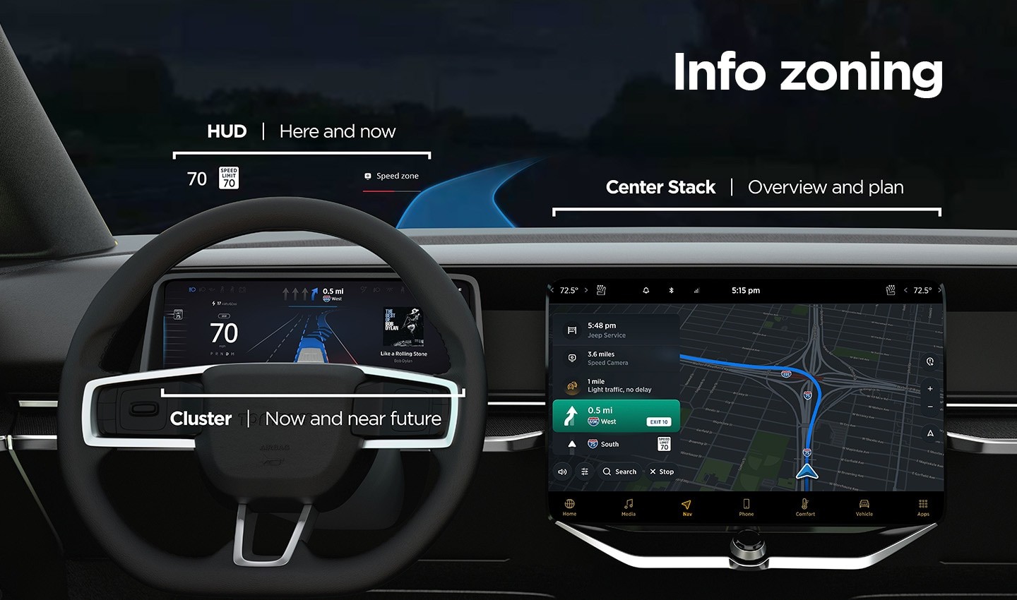
Information zoning ensures that each screen serves a specific purpose and integrates with the entire arrangement of displays. Everything has a place, and everything is in its place.
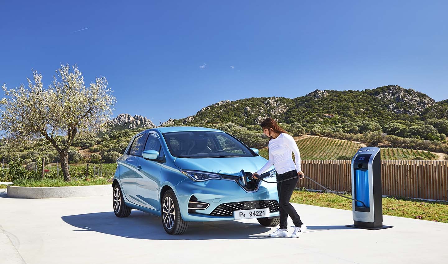
In the case of an electric vehicle, as the car’s battery range decreases, finding a charging station becomes a greater priority. A good user experience would show information on upcoming charging stations clearly, close to the driver’s eyeline.
When the battery is full and charging isn’t a priority for the driver, this information doesn’t need to be as visible. This simplifies information displayed to help drivers act.
Screen overload
Even when information is balanced and displayed carefully, providing drivers with multiple screens still creates stress. So, allowing the driver to change screen views, for example viewing the map on the cluster display rather than the center stack, delivers an element of customization and control which is found to reduce stress.
The information displayed hasn’t changed, but how it is displayed is more tailored to the specific driver.
Imagine you’re driving down the highway, you have your ADAS systems working and you’re cruising comfortably and safely. The next turning you need to take is in more than 50 miles. In this situation you don’t need immediate access to detailed route information, instead, ADAS status updates are more useful to have close to your eyeline.
On the flip side, when you turn off the highway and enter your destination city, where you’re driving through a complex network of streets, one-way systems and taking turns every few minutes, you will want to have navigation prompts on a screen that’s close to your eyeline and easy to interpret.
TomTom’s UX team tested users online in the US and Europe, using simulated driving scenarios and in-vehicle displays which showed varying quantities of information. The company found that users want easy, glanceable and actionable information. This reduces cognitive load and stress.
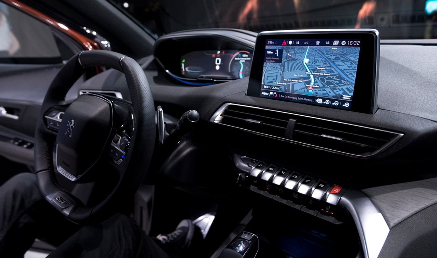
The infotainment system in new Peugeots features a cluster screen and central screen.
One principle: Action plus overview
Despite all the different scenarios and possible applications of in-car screens, it’s clear that their interface design must be guided by the leading principle of providing the driver with information that supports action. Information that’s easy to digest, provides just the right amount of detail, is displayed in the right way and supports the driver based on their current situation for action and overview of the road ahead.
The best vehicle user interfaces are not created by finding the most attractive ways to give as much information to the driver as possible. They are systems of balance and pragmatic design. Ones that elegantly reveal essential information to drivers in the place they most expect it to be. Most of all, they are systems which make driving easier, simpler and safer.
People also read
)
How UX plays a role in the automotive industry
)
Beyond EV range anxiety – keeping the e-mobility revolution rolling
)
Artificial intelligence is trying to take drowsy drivers off our roads and into a rest area
* Required field. By submitting your contact details to TomTom, you agree that we can contact you about marketing offers, newsletters, or to invite you to webinars and events. We could further personalize the content that you receive via cookies. You can unsubscribe at any time by the link included in our emails. Review our privacy policy.