How the world moved in 2020
&w=256&q=90)
As we mark a decade since the TomTom Traffic Index was first launched, we go behind the scenes to reveal how our traffic report gets made and why the 2020 edition is unlike anything we’ve done before.
2020 was a year like no other, changing the way we lived, worked and moved. These profound changes are reflected in this year’s edition of the TomTom Traffic Index. City centers became ghost towns after countries worldwide locked down. Peak hour traffic dwindled as we swapped the daily commute for working from home. Congestion spiked when people left cities en masse to escape new lockdown measures.
Ahead of the release of the TomTom Traffic Index for 2020, we sat down with the team behind this anticipated report. They gave us an exclusive look at what it takes to create the Traffic Index, what made this year unique and what we can expect as we move into 2021.
Q: When did TomTom launch the Traffic Index, and how has it changed over the years?
A: We published the first TomTom Traffic Index in 2011, looking at road congestion levels throughout 2010. The report is now in its tenth year, and with every iteration we keep expanding, looking at more cities, more countries and more data. The first Traffic Index covered 57 cities; in 2020, we analyzed traffic information for 416 cities across 57 countries.
We started out by publishing reports for North America and Europe. We added a report for Asia a few years later and, ultimately, we merged everything into a single global report. In the early days, we also had two separate websites: the TomTom Traffic Index, with historical traffic data, and TomTom City, which showed live traffic data for selected cities. We eventually combined them into the single Traffic Index portal that we have today.
Every year, we also try to look at the data in new and more detailed ways; for example, by adding metrics like time lost in traffic, the best alternative times to travel and congestion levels by time of day and day of the week.
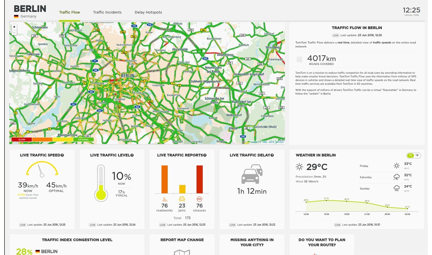 An early version of the TomTom Traffic Index and TomTom City websites
Q: Why did TomTom create the Traffic Index?
A: One of the main reasons why we started publishing the Traffic Index was to help people understand when and where the worst congestion and delays occur, so they could make better choices about when and how they travelled. Initially, our focus was on reaching individual drivers and encouraging them to think about how they could reduce the amount of time they spend in traffic.
As TomTom started expanding into the automotive and enterprise markets, we broadened that core message because we weren’t just addressing consumers anymore, we were also talking to governments, automakers and all other kinds of businesses that rely on traffic information.
Today, our aim is to provide everyone – whether it’s citizens or city planners, business leaders or policymakers – with objective, authoritative traffic information, which they can use to help reduce congestion, improve road safety and lower emissions.
Q: How long does it take to prepare the Traffic Index each year, and what goes into that process?
A: Every year is different, but it usually takes us about three months to put everything together. We start by analyzing the data, which is continually collected by TomTom across the year. The main metrics we look at are congestion levels, time spent driving in rush hour and kilometers driven. Then, we work with design and development teams to visualize the data and prepare the main Traffic Index portal and all the individual city pages.
Obviously, 2020 was not an ordinary year, and that changed the process considerably. We’ve worked on this report for almost the entire year! We’ve analyzed a lot more data and gone much deeper into it than ever before. In fact, we were analyzing congestion information almost continuously because the traffic situation across the world was changing so quickly. The result is that this year’s report includes much more granular detail. For instance, we’ve looked at individual days where congestion levels were exceptionally low compared to 2019. We’ve also analyzed daily commute patterns to see how traffic at peak hours has fluctuated in each city.
Q: What else has been different in 2020?
A: The focal point of the Traffic Index is the city ranking that shows which cities around the world have the worst levels of congestion. We wanted to keep this as our central element but seeing as 2020 has been such an anomaly in terms of traffic flows, we wanted to present the data somewhat differently. For example, it didn’t make sense to showcase cities that improved their congestion levels – like we’ve done in past years – because almost all cities worldwide (with a few exceptions) have seen a reduction in traffic compared to 2019 due to lockdowns and restrictions on movement.
For 2020, our aim was to focus on the ways in which traffic has changed because of the COVID-19 pandemic, and to highlight some of the most interesting events from this year.
Q: What were some of the most memorable stories that came out of 2020? Was there anything that really surprised you?
A: It was really striking to see the mass exodus of people from capitals across Europe when new lockdowns were announced, and how that was reflected in the traffic. The day before Greece’s second lockdown was the most congested day in Athens in 2020. Meanwhile, in Paris, we saw traffic jams reach a record length of 700km on the day before the city introduced new lockdown measures.
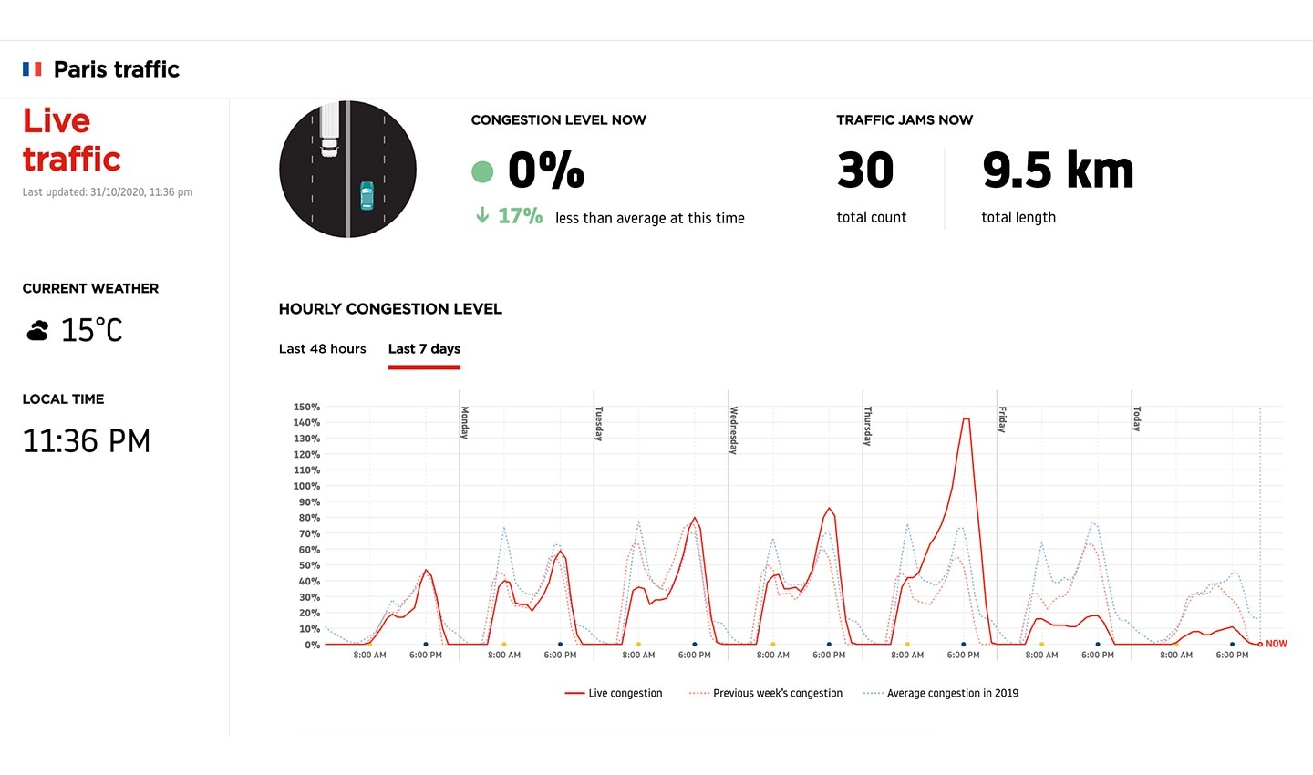 Congestion levels in Paris spiked on Thursday 29 November before the city entered its second lockdown
Congestion levels in the United States dropped sharply and have stayed low. We really weren’t expecting to see that. Most other cities – especially those in Europe –experienced similar dips, but traffic went back up once restrictions ended. In contrast, congestion levels in US cities have remained consistently low, with traffic in most places still very far away from normal levels. It’s surprising because there’s this general impression that things have gone back to normal faster in the US and people are moving around more freely, but the traffic data tells a different story.
Q: Was 2020 just an anomaly, or are there trends that you expect to continue into 2021?
A: 2020 has definitely been a year unlike any other for traffic, but 2021 will be too! Things aren’t going to return to normal overnight. There have already been significant shifts in people’s behavior: We’re working from home more. We’re travelling less often, and our trips are shorter. We’re using more online shopping and food delivery services. However, it’s hard to predict whether these trends will stick around. We can only keep looking at the data and follow the changes as they unfold.
We’re really interested to see if the reduced levels of congestion we saw in 2020 will persist, and if rush hour traffic will continue to improve. The last year has shown that when we act together, even small actions like choosing to work from home or taking fewer trips, can make a big difference to traffic congestion levels, wasted time, fuel use and air quality. It would be such a huge positive if we could come out on the other side of the pandemic with lasting improvements to mobility. It’s up to all of us – governments, businesses and individuals – to reduce traffic and emissions, and we hope that the insights from this year’s Traffic Index encourage people to take meaningful and long-lasting steps towards a safer, cleaner and congestion-free world.
Visit the TomTom Traffic Index to take a closer look at how the events of 2020 changed traffic.
People also read
)
How COVID-19 changed mobility: A look back from the future
)
What can traffic data tell us about the impact of the coronavirus?
)
Can traffic data help us find a way out of the lockdown?
* Required field. By submitting your contact details to TomTom, you agree that we can contact you about marketing offers, newsletters, or to invite you to webinars and events. We could further personalize the content that you receive via cookies. You can unsubscribe at any time by the link included in our emails. Review our privacy policy.