)
From trips departing from the city of Lysekil, Sweden, going to east and further south in Sweden, what is the preferred way?
Question
From trips departing from the city of Lysekil, Sweden, going to east and further south in Sweden, what is the preferred way? The ferry between Finnsbo and Skar or the road north of the Farlev Fiord?
Given the possible waiting time and busier hours of the ferry, would drivers consider taking the longer route?
How-to Explanation
In the “Region” definition of the analysis, Lysekil was defined to be our main “origin” area.
The destination needed to be in a good place to capture the trips that would justify the use of the ferry, in the first place. For people going to northern Sweden, taking the ferry would bring no advantages at all.
Two via regions were defined accordingly: one at the access to the ferry and other on the northbound road, close to the access to the main highway.
Reading the results
By using the “Map Flows” results visualization, the first analysis is already very representative. On average, around 70% of the trips still opt to use the ferry, even with possible waiting time (Figure 1).
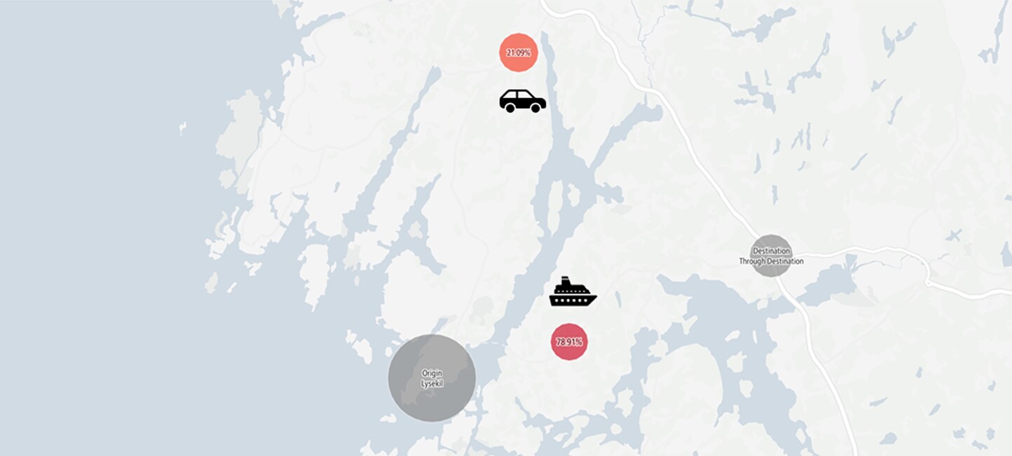 Figure 1: Map Flows visualization of the results.
Important to note that seasonal differences might play a big role here. Comparing the results from March 2019 with July 2019, the ferry usage goes down by 10% (Figure 2).
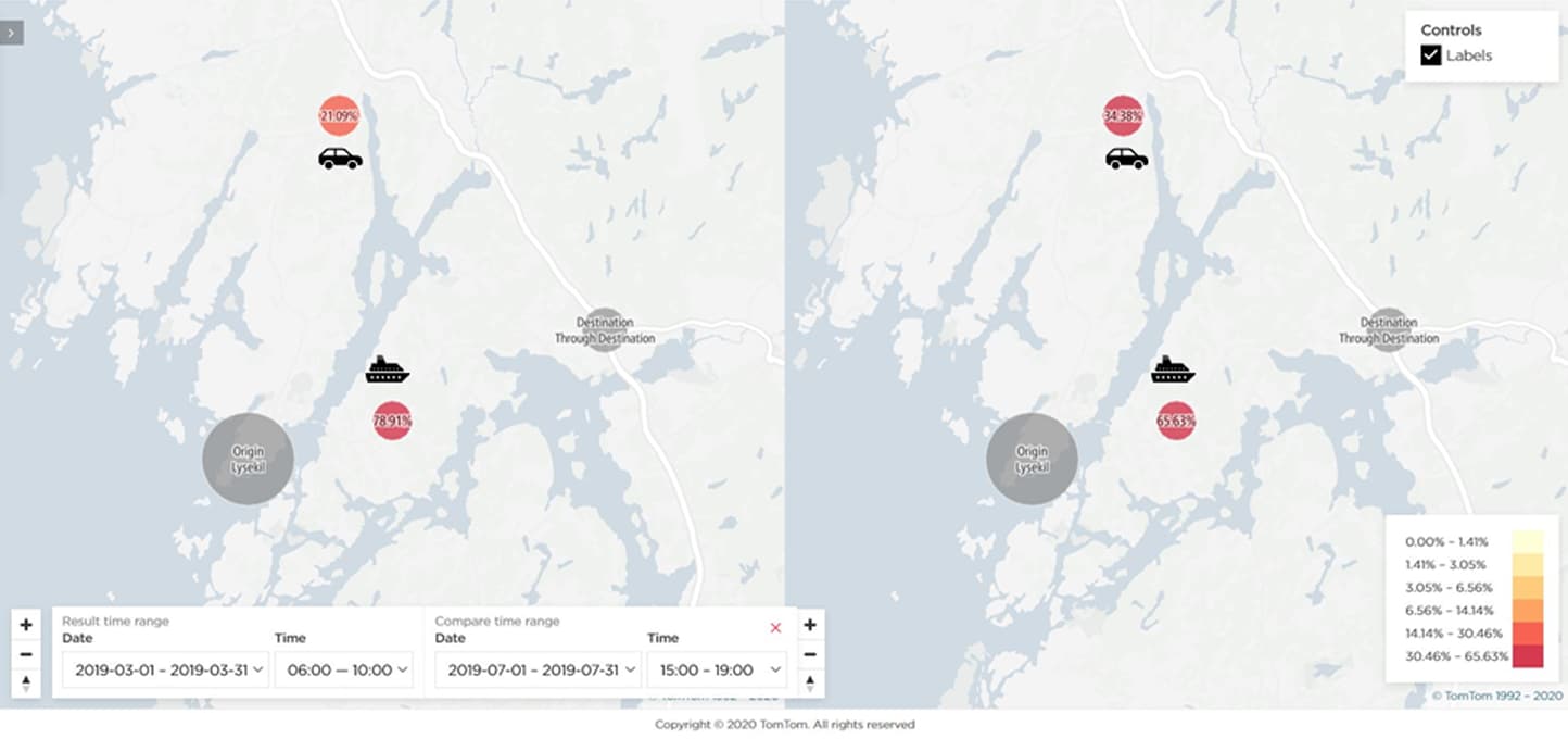 Figure 2: Map Flows visualization of the results.
By using the “Flows Explorer” visualization mode, we can go even deeper in the analysis, by understanding the trip distribution throughout the day (Figure 3). The horizontal axis gives you the 24h distribution and the volume of trips per each hour (vertical axis). This view gives quick insights on busiest hours of operation (horizontal axis) and possible actions to take in order to promote a different use or a different access.
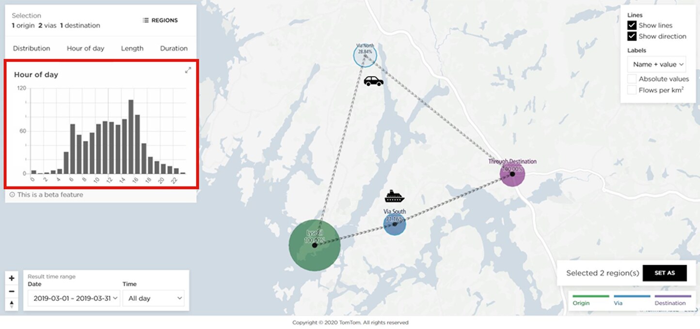 Figure 3: Flows Explorer visualization of the results.
Conclusion
Starting from the assumption that ferries generally add more hassle and waiting time, it would be fair to believe that drivers would still prefer to take a longer road trip and try to avoid it. A quick O/D Analysis showed us that the great majority (almost two thirds) of all trips going to east or southern Sweden, choose to travel by ferry.
The TomTom O/D Analysis provides a rich, comprehensive and yet very attractive in terms of cost/value benefit. In matter of minutes, the GPS-based trip analytics give you a comprehensive analysis, encompassing large areas and flexible time periods, which would be less efficient and with poor results when performed with manual input questionnaires or only hardware data (e.g.: sensor cameras with limited area range).
People also read
)
Stadium traffic during a football match
)
DXB Airport & Covid: Traffic insights with our analytics tool
)
Inside TomTom's traffic products: Origin Destination Analysis
)
Clearer roads, faster trips: The data behind NYC’s congestion pricing success
* Required field. By submitting your contact details to TomTom, you agree that we can contact you about marketing offers, newsletters, or to invite you to webinars and events. We could further personalize the content that you receive via cookies. You can unsubscribe at any time by the link included in our emails. Review our privacy policy. You can also browse our newsletter archive here.