)
In early February, TomTom published the 11th edition of its annual Traffic Index. Since then, there have been a few comments of concern raised on Twitter about the data not accurately reflecting the extent to which lockdowns impacted traffic. I spoke to the Traffic Index experts to find out why they don’t adjust for these kinds of variables.
Through all the comments TomTom saw, there was a general theme: the pandemic. Many were keen to point out the fact that the pandemic has influenced and reduced traffic, which has led to many stories about positive drops in congestion and inner-city congestion. Stories that, in a normal year, we wouldn’t have seen. The implication was that we shouldn’t acknowledge this impact because the pandemic was so unexpected and unplanned.
Further critique of the data was directed at the fact that it didn’t ‘adjust’ congestion and emission figures to compensate for the impact that coronavirus lockdowns did have on traffic. On the surface, this seems like a fair assessment. However, speaking to TomTom’s experts, there is a clear rationale as to why the company hasn’t attempted to adjust its data.
Andy Marchant, one of TomTom’s Traffic Index experts, puts it simply, “The TomTom Traffic Index is designed to be an accurate representation of reality. What we report are the facts”.
“Lockdown is something that’s happened and has had an impact on traffic in some places, and zero impact in others,” he adds. “For people to say we haven’t taken it into account, I think is incorrect. What would have been wrong is if we’d tried to come up with a methodology that allows us to ignore the lockdowns. Because they did in fact happen everywhere”.
What’s more, not all lockdowns were created equal. Some people were allowed out of their homes even though nothing other than grocery stores were open. Others were allowed out but weren’t allowed far from where they lived, while other groups couldn’t leave their homes at all. So, the question of ‘adjusting for lockdown’ is now one of how to do it when lockdown measures were not consistent.
Comparing different cities
It’s worth noting, the comments seemed to also focus on the need to compare traffic in one city to another. However, comparing the average level of congestion in one city that locked down for six months to a city that locked down for just one month doesn’t seem fair. So, on one hand, trying to level the playing field and neutralize how variables impact traffic does appear to make sense if you’re only concerned with comparing different cities.
But if that’s our line of reasoning, we present ourselves with yet more questions: how should we model and factor the differences across cities? Where should this model start and end? And what are we trying to show with the resulting data?
We know that weather adversely affects traffic, so should we factor that in? What about differences in infrastructure? Should we neutralize the impact that cycle lanes or public transit have on congestion? Should we pretend that low emission zones don’t exist? What other variables are there that affect traffic that we should consider and account for?
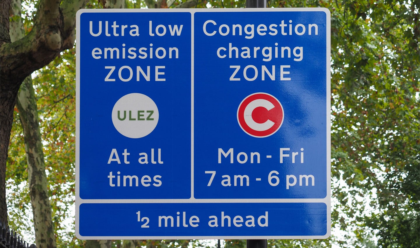
London’s Ultra-Low Emission Zone prevents the most polluting vehicles from entering the center. A congestion charge applies to all vehicles, to reduce traffic volumes.
A global city ranking
If these variables were considered, we wouldn’t be comparing reality, we wouldn’t be showing the truth of what is actually happening on the ground. While it might allow us to rank every city in the world with what seems like more standardization and some comparative fairness, the truth is it wouldn’t be an inaccurate data set.
Taking a different approach; it would be possible to rank cities by which one has improved its congestion situation the most. This would allude to some kind of “most improved” rank, comparing cities to themselves and then ranking them based on that. But even then, as Marchant points out, it would not necessarily yield a clear or accurate picture of the state of global congestion. Some cities are far more concerned about congestion than others.
“We talked about the Traffic Index rank, and we said we could create the ranking based not on the worst performing city in terms of congestion but then base it on which city has improved the most,” Marchant explains. This might sound preferable to some, but on further inspection it’s still not the silver bullet critics are looking for.
If TomTom were to rank cities based on which has reduced congestion the most compared to last year, it would unfairly favor the cities that were hit with the most stringent and extreme lockdowns, Marchant explains. So, as with trying to factor the impact of lockdowns, this approach would do the exact opposite and give lockdowns excessive influence over the Traffic Index’s rankings. It would become a ranking of simply what cities were hit by the pandemic the hardest, no longer is it a measure of traffic.
TomTom’s Traffic Index data scientist, Anna Nowak, adds more detail: “The rank has always been the same, we provide the number for the full year. That number doesn’t tell the whole story, but it tells you something to start with.”
On TomTom’s Traffic Index homepage, more than 400 cities around the world are ranked in terms of congestion. This serves as a starting point for readers, an overview from which to dive into, Nowak tells me. There are plenty of filters that readers can use to organize the data by what context they feel is most appropriate.
Indeed, looking at the global ranking, there are some trends that present themselves, for example, the most congested cities tended to reopen quickly after lockdown, have poor public transit, regularly experience bad weather, don’t support cycling all that well and are incredibly car-dependent.
“People can argue that we’re comparing cities that have no snow with cities that have four months of snow,” Nowak says. “That can be argued indefinitely because there is always going to be some kind of difference, it’s very difficult to account for.”
The fact is, all cities are different, all responded to coronavirus in their own way. To try and account for differences would fail to demonstrate the uniqueness of each location and how its traffic is impacted by its own policy, geography and global events. As one of our other blogs on the topic alluded to: TomTom Traffic Index is a barometer of social activity, which is to say it takes a ‘temperature reading’ and reports it.
For that matter, when we’re considering the differences in weather around the world, we don’t try to compare the average temperature in Norway to that of Egypt. Why? Because we know they are two very different places and it’s basically impossible to even begin to attempt to compare them. There’s plenty of self-evident context as to why that’s the case.
A global ranking is a useful way to quickly show how cities stack up against each other, to provide a springboard for readers to dive into the data from. But just because a city goes up (or down) in the ranking doesn’t mean that its level of congestion has improved. If we want to draw specific conclusions, we need to look at the individual city specifically.
Traffic changes over time
There is value in showing how traffic in one city has changed over the years. It lets us see how one government’s approach to lockdowns affected traffic, and it also allows us to compare the impact that changes in infrastructure and policy have – providing a sort of before-and-after picture.
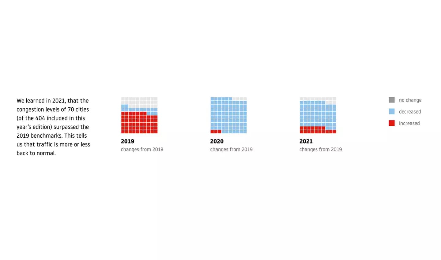
Comparing the changes in congestion levels in 2019, 2020 and 2021, we can see how lockdowns have impacted our cities. It will be interesting to see if we ever see congestion levels higher than they were in 2019, before the pandemic. If they don’t recover, we can consider it a more permanent change to our travel habits.
This is possible with the Traffic Index: clicking on an individual city shows how congestion has changed by the year, month and week, which gives a much more accurate picture on how the traffic situation is evolving in a particular city.
Marchant points out that for the data to remain insightful, this year, TomTom took the decision to include comparative data for 2020 and 2019. “2019 was the last full year before the pandemic and is what we consider the pre-pandemic normal. Comparing 2021 and 2020 to 2019 gives a good indication of how coronavirus impacted traffic and congestion.”
The real issue of interpreting the data
The comments mentioned at the top of this article point to a bigger question. One we all face every day in a world saturated with numbers and data. Whether TomTom ‘adjusts’ for lockdowns, or any other variables for that matter, and how it ranks cities as part of its Traffic Index, is not really the question we should be asking – we should be challenging ourselves with how we interpret the data the company presents.
All data, whether it’s about traffic, the weather, or how many goals your favorite football team has scored this season, requires a layer of context when it’s being interpreted. TomTom gathers, processes and visualizes traffic data to accurately represent what is going on in the world. It organizes it in many easy-to-understand visual formats that are loved by many all over the world.
Many city authorities use the Traffic Index to monitor how congestion, and now emissions, are changing in their particular city. Naturally, those bodies have immense amounts of context about what’s going on in their locale, so TomTom presents the observations, and the city authority can interpret it and see whether traffic is responding positively to their policy and infrastructure improvements.
What matters to those at TomTom, as Andy Marchant and Anna Nowak demonstrate, is accuracy and being a true, fair and unfiltered representation of reality. The geolocation tech company doesn’t want to start adjusting data to compensate for unexpected realities. The Traffic Index is a scientific tool, it’s not intended to neutralize political agendas, it reflects a global shared reality, and it’s down to the reader to interpret the data in relevant context that matters to them.
If we have problems or issues that traffic has dropped only as a result of an extreme lockdown measure, and we’re fearful it will return as soon as the pandemic is ‘over’, that’s a problem we have to fix in reality, it’s not one we can fix with the Traffic Index. But you can be sure that the Traffic Index will show us the data and let us know when we have indeed fixed it.
People also read
)
Do low emission zones work? TomTom Traffic Index has the answer
)
The changing shape of inner-city traffic: How COVID-19 changed the way we move in 2021
)
Here are the world’s most congested cities according to the 2021 TomTom Traffic Index
* Required field. By submitting your contact details to TomTom, you agree that we can contact you about marketing offers, newsletters, or to invite you to webinars and events. We could further personalize the content that you receive via cookies. You can unsubscribe at any time by the link included in our emails. Review our privacy policy. You can also browse our newsletter archive here.