)
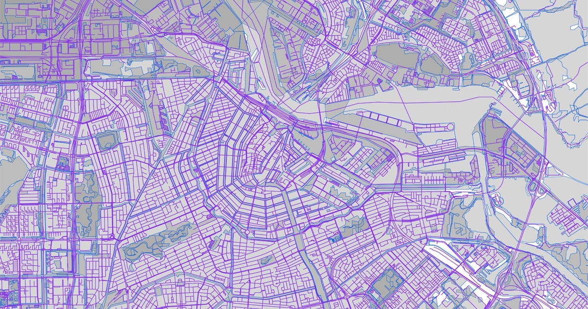
Making maps is a tricky business, reading them can be equally tricky too, especially if you aren’t able to perceive a full spectrum of color. All those fine lines, colors, contrasts and shades can make it difficult, if not impossible, to differentiate between road types, features, grid lines, contours and other map features. Thankfully, with more mindful design, we can make maps accessible to everyone.
Map design relies on color. Line widths, patterns and other visual textures and cues can’t tell the full story. But shades within colors can separate neighborhoods, states, highlight geofenced areas and even delineate whole countries. Even maps focusing on natural areas usually take advantage of various earth tones to signify rivers, lakes and parks. Adding color to maps brings texture, context and detail, but this approach generally relies on map readers being able to interpret full spectrums of color.
When someone doesn’t see color in the same way most of us do, what might be a well-intentioned color choice on a map — to indicate a road type — could become incredibly hard to distinguish. For those unable to differentiate colors, it can make a map close to useless.
Some 300 million people are affected by color vision deficiency — or nearly 1 in 12 men. Countless digital map users, probably more than we realize, stand to benefit from highly thoughtful, more inclusive color design and choice.
Want to learn more about color blindness? Click here:
One way of designing maps to be more inclusive is using TomTom’s Map Styler. With this, users, developers can customize mapping layers with color palettes created specifically for different color vision ranges. They can even create a map with a color scheme that can be interpreted by all forms of color vision deficiency all at once.
Adapting color palettes
In most cases, it’s possible, and usually best practice, to modify a color palette to better support certain types of color blindness. These are best tailored for specific types of color impairment, such as deuteranopia (a deficiency in green sensing ability), protanopia (a red deficiency) and tritanopia (a blue-yellow deficiency).
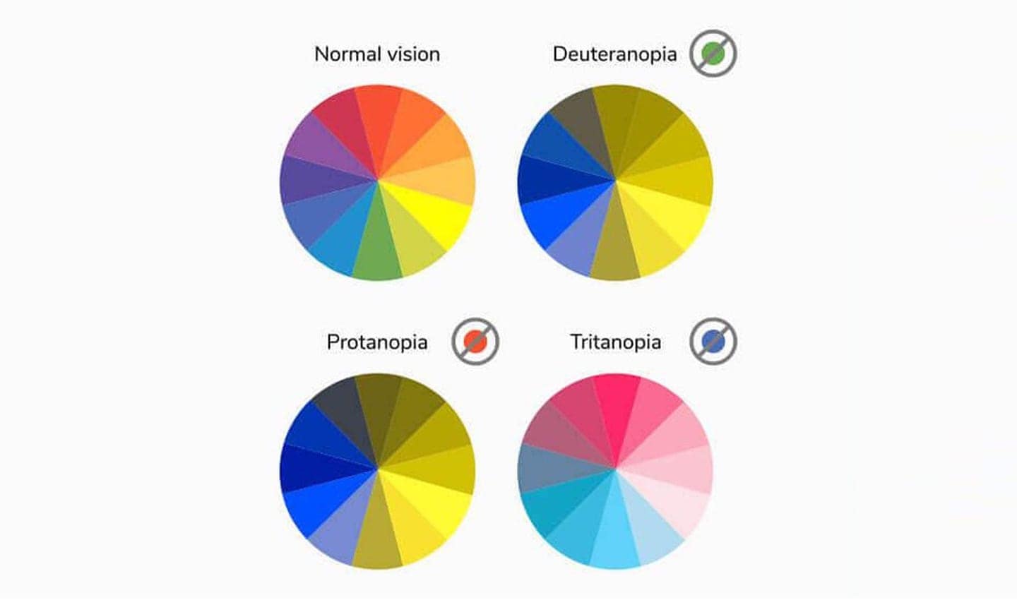
Image from Venngage
The most common forms of color blindness are red and green-related. This means that a color vision impaired person’s perceived color spectrum shifts red and green hues to more yellow shades. It eliminates red hues which usually blend to make purples. This leaves the individual with a difficult in distinguishing blue and purple. As they can’t sense the red that is used in purple colors, purple hues all end up looking like blues.
Those with tritanopia have trouble telling the difference between blue and yellow shades, which is why their color spectrum reflects pink in many instances.
But it’s not just about colors. We also need to think about their shades. Consider monochromatic color schemes. These often complement many design elements, but unfortunately can make important information less accessible for the most common forms of color blindness.
Using high contrast colors, in general makes shaded maps and design much more accessible. It’s also worth avoiding the following color combinations as they can often make it hard to interpret maps for those with visual color impairment.
Red & green
Green & brown
Green & blue
Blue & gray
Blue & purple
Green & gray
Green & black
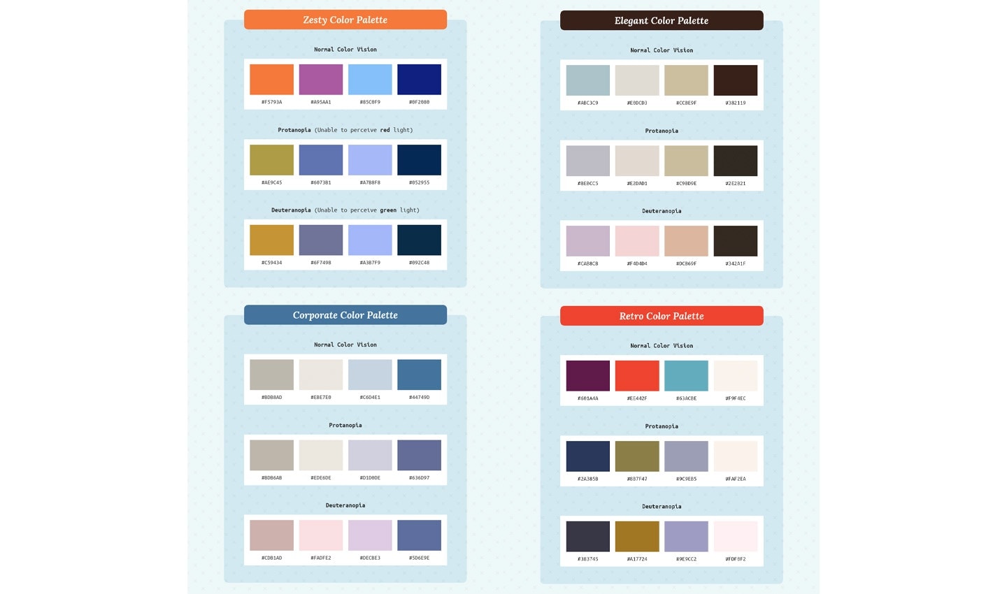
Using color palettes curated for the visually impaired from Venngage, a company that specializes in infographic design, it’s possible to design and style a map to be more readable for those with color deficiency. The video below shows a few examples of how using high-contrast color pairings can create a highly detailed map, but still easy to read for the visually impaired.
The retro color palette gives a great ‘pop’ to streets and other road elements, and has a high contrast which makes smaller details even more visible than before.
Interested in high contrast mapping?
If you want to learn more about how the color-accessible map in the video above was made TomTom’s developers documented the process. Check out their GitHub repo with the specific styles. You can even give it a go yourself and style your own color impaired-friendly map.
If you do, share it with us on Twitter, our subreddit r/TomTomDevs or in our Developer Forum. This article was adapted from a story that originally appeared on TomTom’s Developer blog, to read the original, click here.
Edited and adapted by Matthew Beedham, TomTom EditorialPeople also read
)
The Boise boom: How mapmakers keep on top of boomtowns
)
How location data can help emergency responders get to incidents quicker and save more lives
)
How routing algorithms prioritize safety over speed in rural Finland
* Required field. By submitting your contact details to TomTom, you agree that we can contact you about marketing offers, newsletters, or to invite you to webinars and events. We could further personalize the content that you receive via cookies. You can unsubscribe at any time by the link included in our emails. Review our privacy policy. You can also browse our newsletter archive here.